
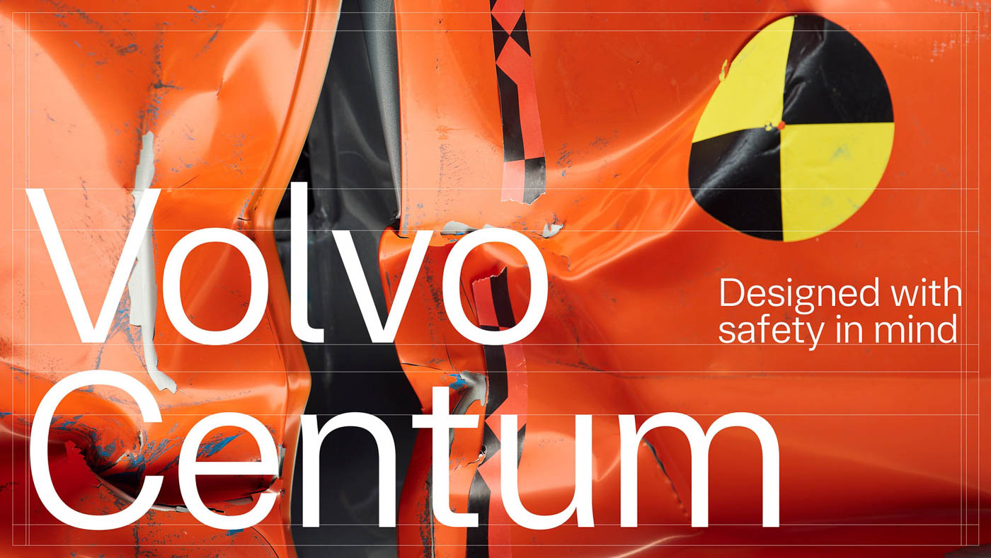
We’ve all heard about Volvo and their endless – and almost obsessive – pursuit for safety. From LiDAR sensors to the new multi-adaptive seat belts, the Swedish carmaker meticulously pores over every little detail, all for the purpose of achieving its goal of zero road crashes in a Volvo. And their latest innovation in their grandiose quest? A new Volvo font for the text on the screens in their cars.
Called the Volvo Centum, the new typeface, created by Dalton Maag, a London-basedtype design studio based in London, is said to help people “read faster, understand better, and stay focused” on driving. With how prominent screens are becoming in cars, it’s a surprise no one has done this earlier.
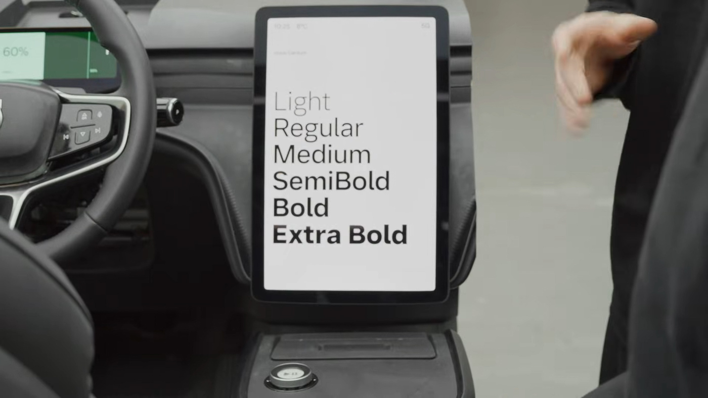
The typeface was made with simplicity and extreme legibility in mind, with visual clutter reduced to a minimum, aiding drivers in reading whatever on-screen at just a glance. “Every detail in our interface is an opportunity to create clarity and confidence, and a more intuitive driving experience, so that our customers feel safe and can trust the car,” Volvo Cars UX creative director Matthew Hall said in an interview with design magazine Dezeen.
“Designing for motion and glance-based reading requires a different mindset. This is typography engineered to perform under pressure, across languages, and at 100 km/h”, Dalton Maag Creative Director, Zeynep Akay added.
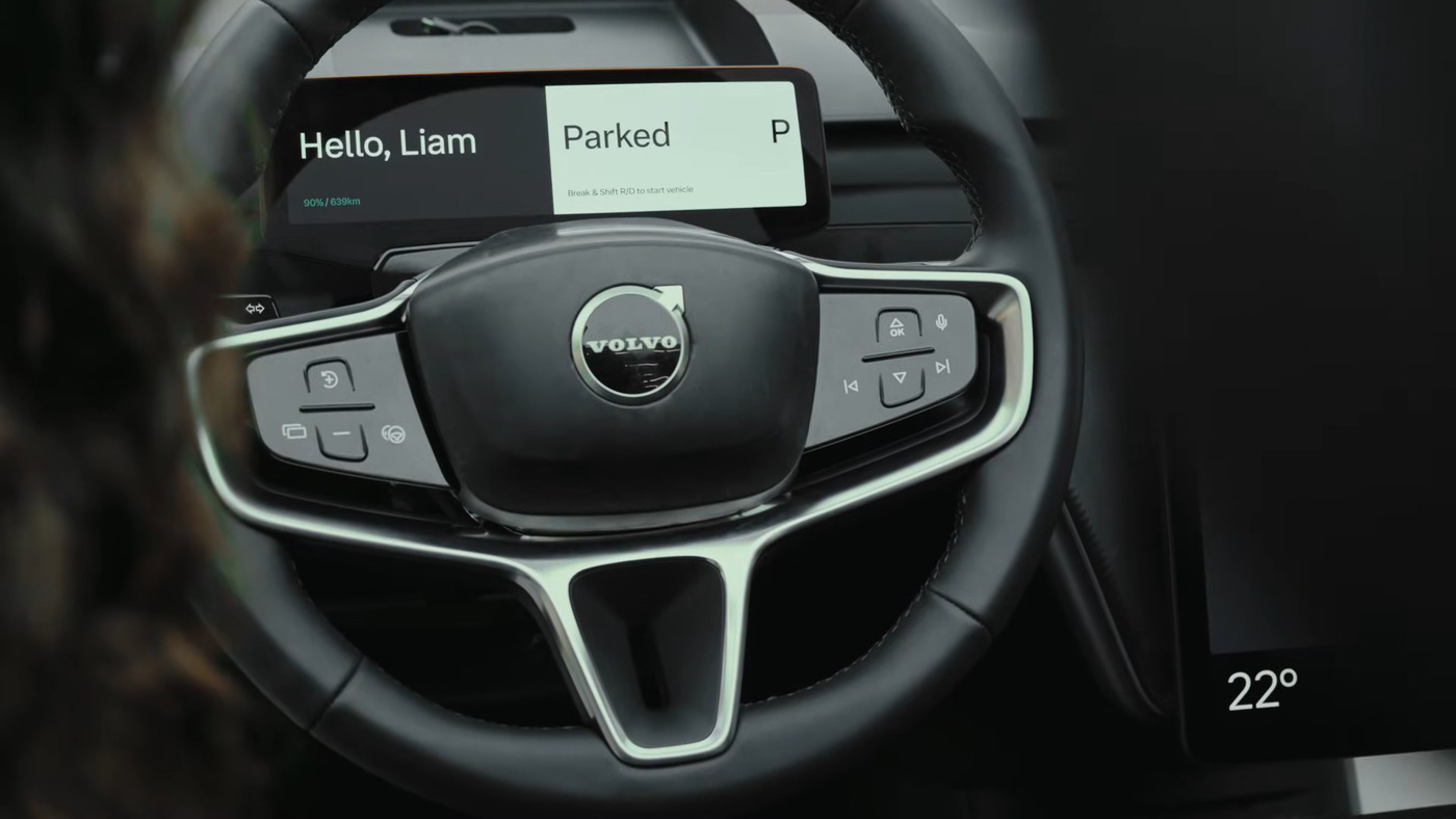
Volvo says the new font is made to work across all platforms – both in and out of the car – and driving conditions, and will support 35 language, including complex scripts such as Chinese, Arabic, Japanese, and Korean.
It’ll debut in the upcoming Volvo EX60, with a wider rollout planned across other models and touchpoints in the near future – the former done via over-the-air updates. By the way, the name Centum is a reference to Volvo Cars’ upcoming centennial in 2027, and we’re certain there’ll be more proper celebrations coming next.


