Conforming to recent industry trends, Rolls-Royce today unveiled its new brand identity, featuring a redesigned logo and a new Spirit of Ecstasy illustration that’ll be more prominently featured throughout the brand’s new identity.
But the rebranding doesn’t just stop there – there’s also a new colour, and Rolls-Royce now even calls itself a “House of Luxury” instead of just makers of some of the finest luxury vehicles on the planet. What on earth does that even mean? Well, let’s dive right in…
Rolls-Royce says that the purpose of the new brand identity was to resonate itself with its new younger buyer demographic, a direction that the luxury marque has embarked since the launch of the Black Badge family in 2016. In recent years, the average Rolls-Royce clientele’s age is now down to 43.
Rolls-Royce CEO Torsten Müller-Ötvös explains: “As the marque’s digital presence increases, there has never been a more important time for the visual language of the company to reflect our standing as the leading luxury brand in the world.
“We have embarked on a fascinating journey of modernising our brand identity to echo those changes seen in our portfolio, our client demographic, their lifestyle and the luxury world that surrounds them.”
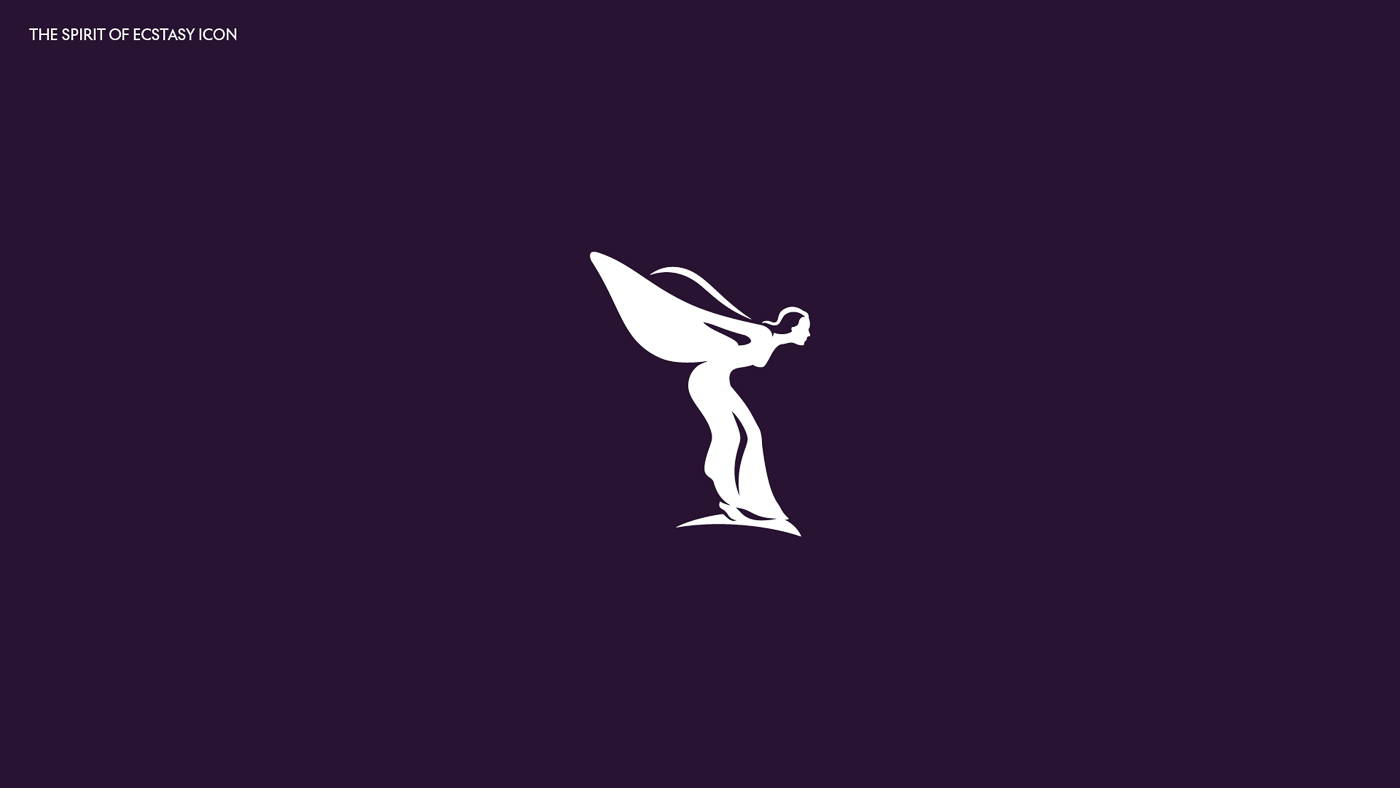
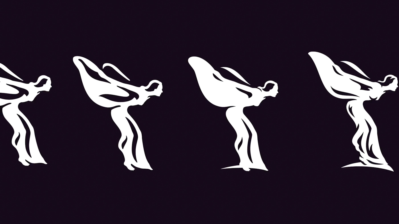

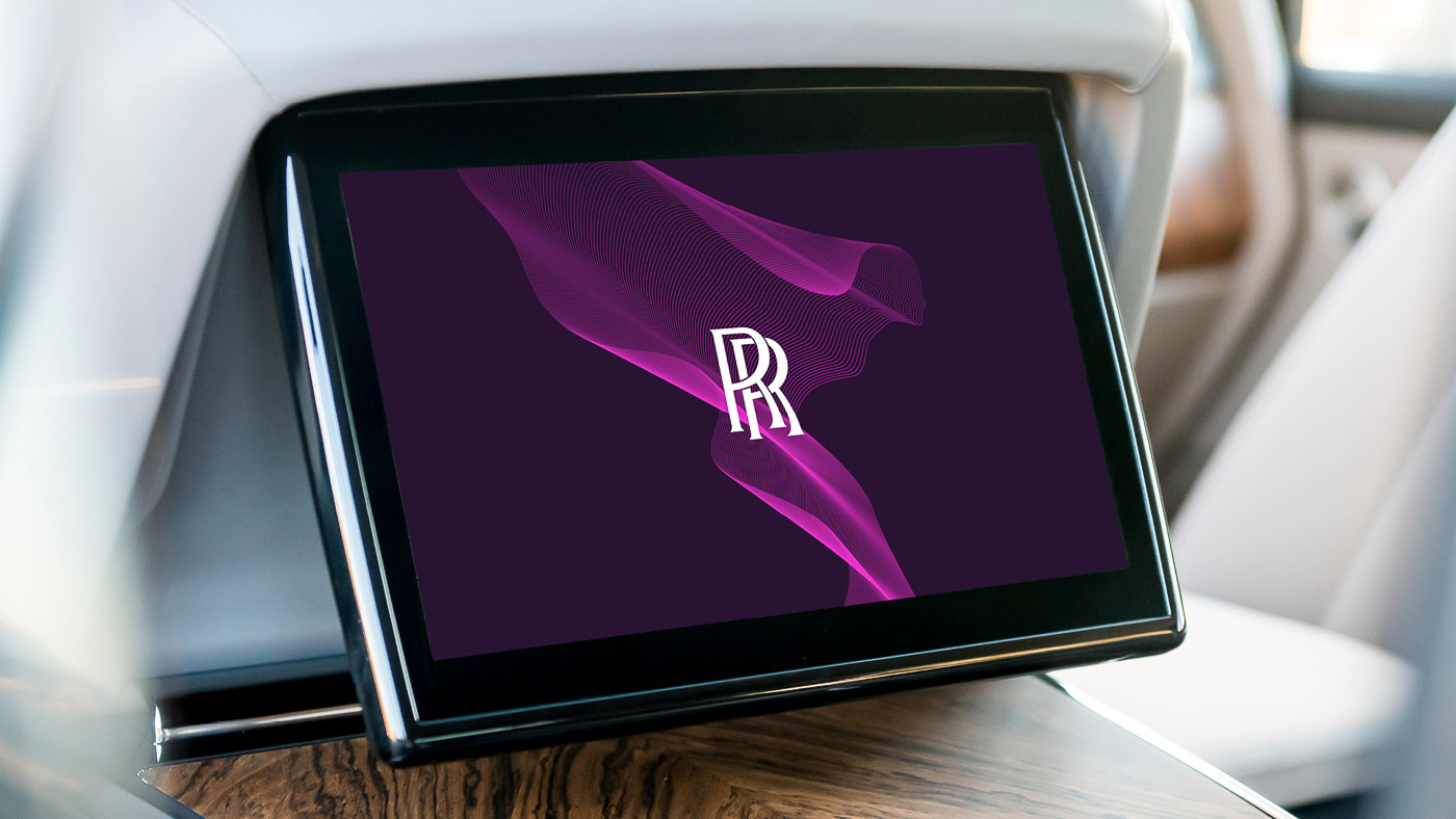
Starting with the Spirit of Ecstasy; the iconic “Flying Lady” mascot will remain unchanged on its cars. However, the 3D winged sculpture has also been turned into a two dimensional illustration, pointing towards the right, which supposedly means “boldly facing the future.”
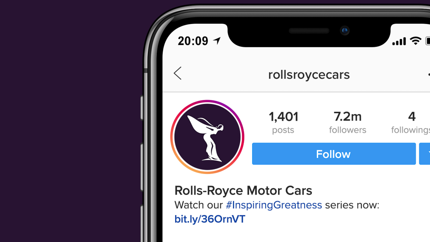
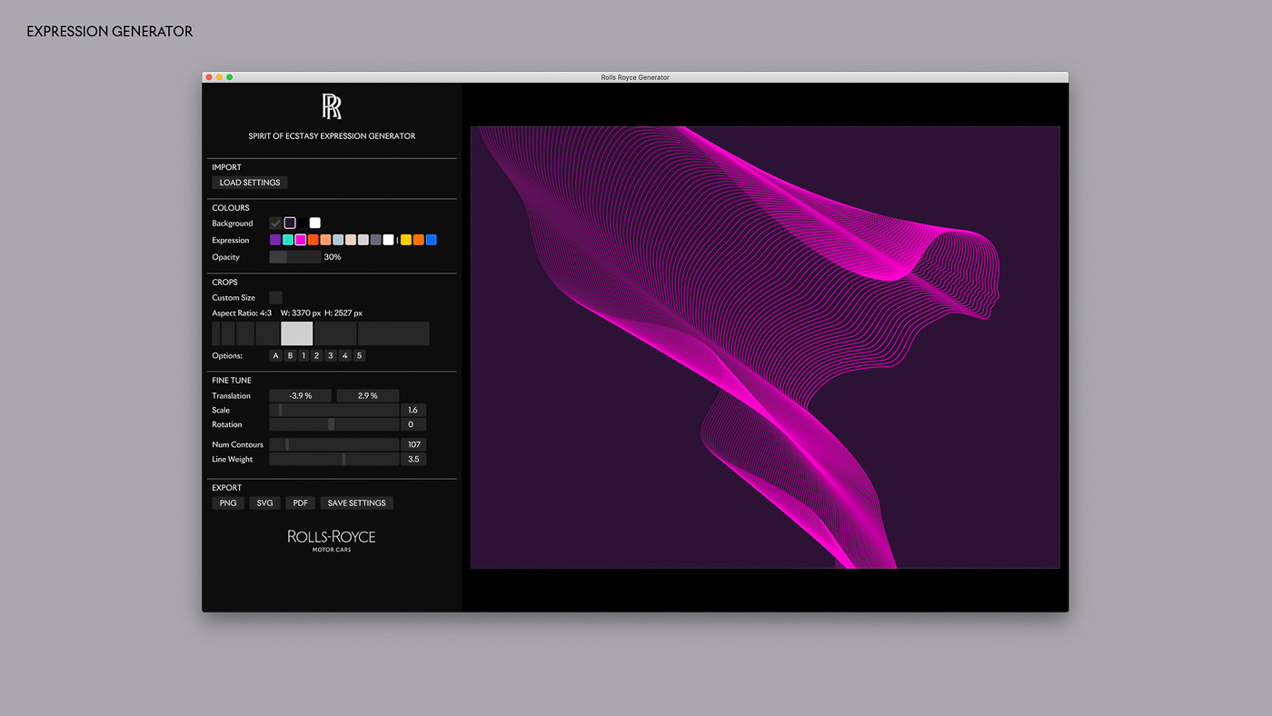
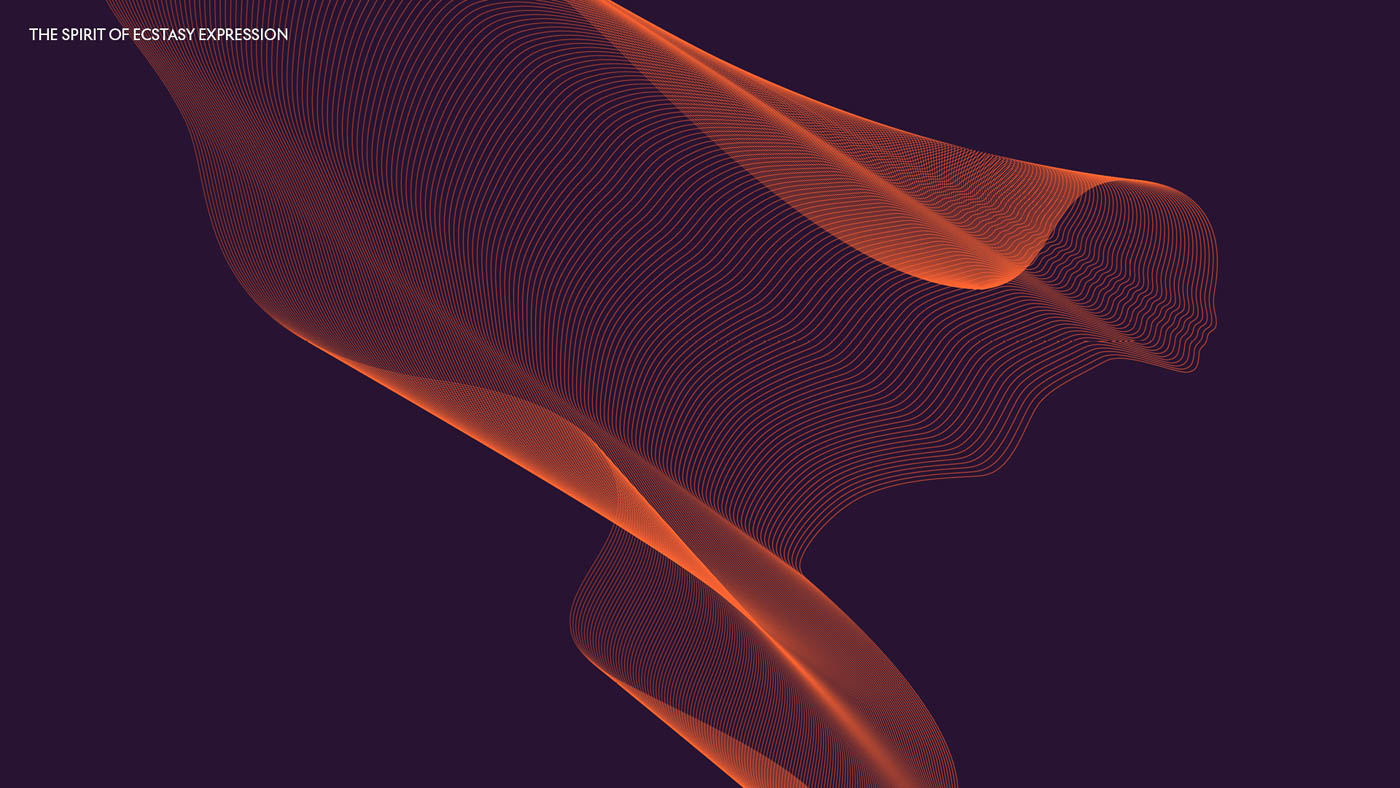
The new illustration will be used prominently throughout Rolls-Royce’s new brand identity – especially online, such as on its Instagram page profile as shown here. There’s even a Spirit of Ecstasy Expression, which transforms the iconic figurine into a super cool wireframe art piece. The expression can be applied to all sorts of surfaces, from projection to embroidery, printing to engraving, and will be applied in its physical establishments as well as in digital form.
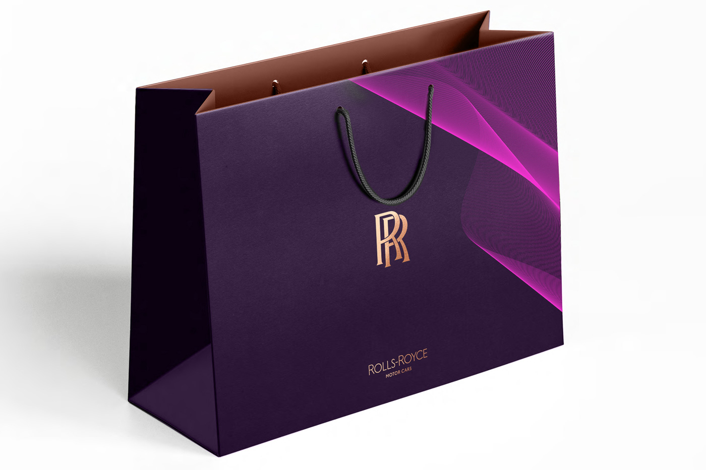
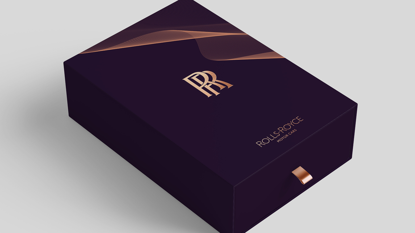
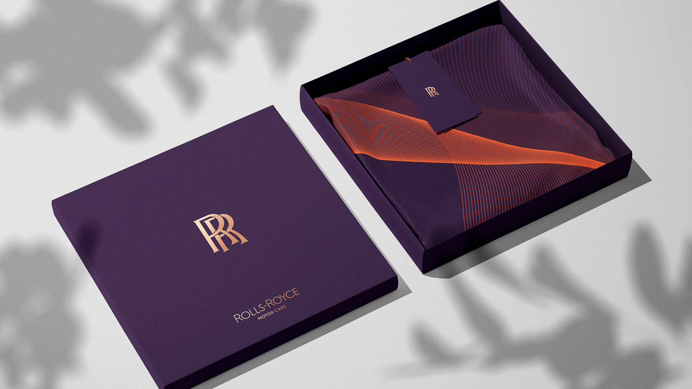
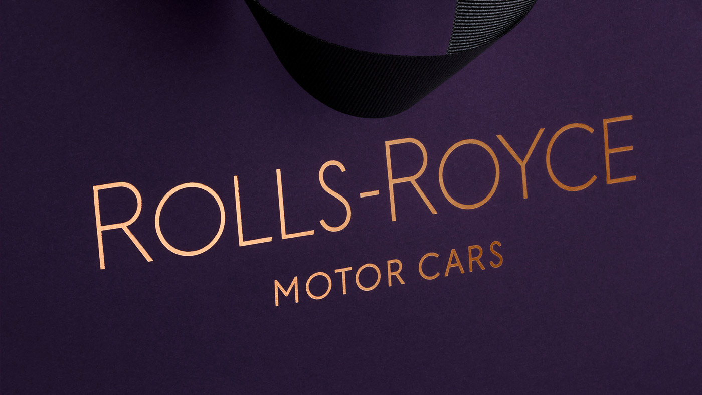
You might have noticed the elaborate use of a deep purple colour on all of these images. Dubbed Purple Spirit, the new colour is chosen to signify wealth and power – as seen in mythology, art, piety and royalty, according to Rolls-Royce.
The dark purple colour is complemented by a rose gold colour, which apparently adds elegance and grace, though it’ll only be used on printed materials.
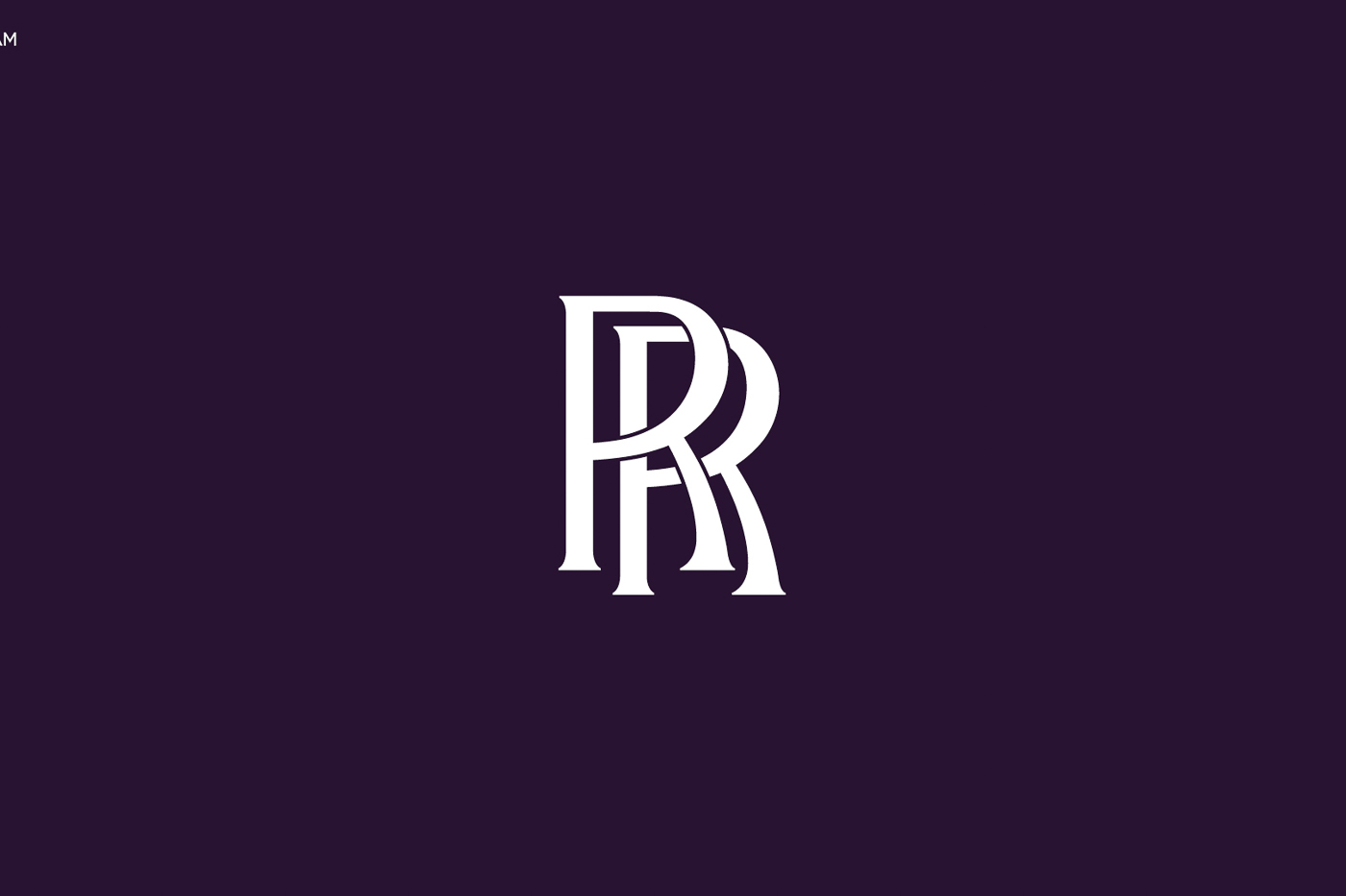
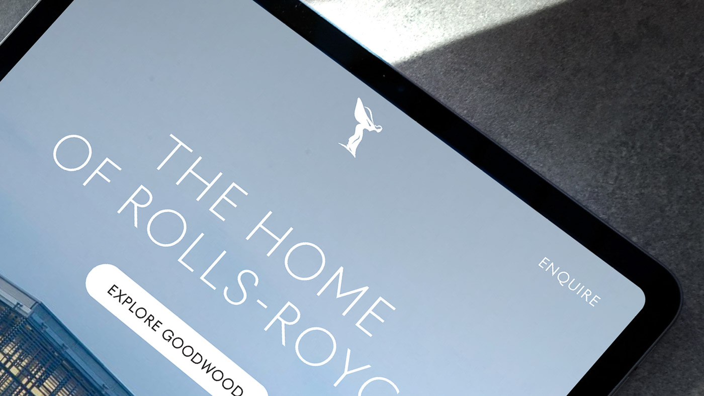
As for the logo, the “Badge of Honour” will also remain as it is on its “precious creations born at the Home of Rolls-Royce in Goodwood, West Sussex” (which means their cars, by the way), but a new standalone double-‘R’ monogram logo – without the Rolls-Royce wordings and bounding boxes – will be used on everything else.
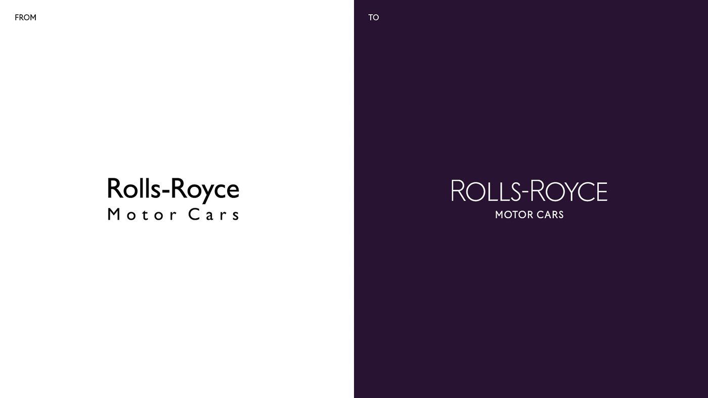
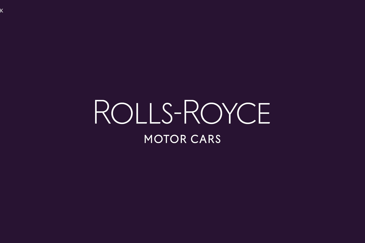
The brand’s word mark have also been tweaked, with the new design based on old typography uncovered from the marque’s old archives from the 1930’s. The ‘Motor Cars’ words have been reduced in size, reverting the emphasis back to Rolls-Royce and its wider influence outside of just automotive.
The luxury car maker even chose a new typeface – called Riviera Nights – for all of its written communication to depict “luxury” and its “connection with the marque’s rich history”, without being overtly decorative.
As for the whole “House of Luxury” thing, here’s what Marina Willer, lead designer of the rebranding project, has to say: “What soon became apparent is that Rolls-Royce has evolved from being regarded as an automotive manufacturer into a leading light in the world of luxury. It was essential for us to ensure that the brand’s new identity reflected this shift. We needed to present Rolls-Royce in a forward-facing, fresh and relevant way – speaking to new audiences while respecting the company’s loyal clients.
“I do not come from an automotive background. This vantage point provided me with the opportunity to observe Rolls-Royce as a manufacturer of luxury products. My ambition was to celebrate the luxuriousness of the brand while providing it with the means to visually communicate with Rolls-Royce’s younger, increasingly diversified audiences,” she added.

Aside from all the designer speak mumbo jumbo that doesn’t really mean anything to regular people like us, we think that Rolls-Royce has actually done a really good job in its rebranding exercise – despite its simplicity. Does it really help appease the younger crowd though? You be the judge.
IMAGE GALLERY