
The letter “R” in motorsports sends a strong message to others that the car has every intention to be in front of the pack. Utter the words Type R or GT-R and you know what I mean.
Within Proton, the letter “R” also holds much significance as their motorsports division (albeit in cold storage) is called R3 – Race, Rally, Research.

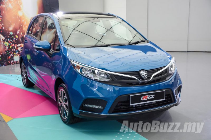
In the facelifted Proton Iriz, the national carmaker has introduced not only styling enhancements and new features, but they’ve also redesigned the Iriz logo with a bold red font for the letter “R”, in capital letter no less.
Chief Designer for Proton, Azlan Othman answering to a question on the new logo in a media Q&A session said that the new logo “is a teaser to what’s to come in the future”, without elaborating further. Possibly Proton has plans for a performance-oriented Iriz?
Considering that Proton recently took home the championship title at the 2018 Sepang 1,000 km endurance race with the Iriz, the arrival of a performance, road legal Iriz is pretty timely as the story ties in well with their recent win.
Here’s hoping that a Proton Iriz hot hatch turns into a reality and please Proton, if you’re reading this, make it a manual.


